We have spent the last few weeks rethinking the Nimiq brand. This process brought our mission, vision, brand persona and core values to a point where we were able to develop a visual language. We’re proud to finally show you this visual language, and, along with that, we also want to share the process of how we got there.
The Process
First of all, we weren’t starting from scratch. Nearly two years of legacy can’t and shouldn’t be neglected when embarking on a significant brand update. We looked closely at everything that was out there, sat down with the team, and conducted interviews with the community. We asked the hard questions to get an honest understanding of what the brand Nimiq is, rather than just creating an artificial image of what we imagine it to be.
Drawing on those insights, we created a brand persona with character traits and a certain behavior, a persona not rooted in theory but in reality. In this way we can realistically embrace those characteristics that we want Nimiq to be associated with, and work on others that we don’t.
Simplicity
One of the most important values Nimiq strives for is simplicity. In the belief that stripping away everything that’s not necessary will lead to less cognitive load and eventually to a better experience. We took this ideal and built our efforts around it.
The Logo
When we started thinking about a new logo, it was clear from the beginning that we didn’t want to do a U-turn, but instead identify what we want to keep and what needs to go.
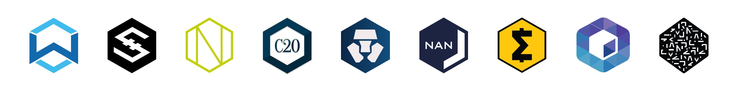
Changing the logo was probably the biggest request from the community in terms of rebranding, so we actively included them in this process. We asked for input and got a lot of it — from rough directions to concrete and professional logo suggestions. Interestingly, in most of those suggestions, the hexagon played a central part. We, too, felt that the hexagon, standing on its stable side, was deeply connected with the Nimiq brand. Not only was it part of the logo, it was also used as a key visual for loaders, backgrounds or the world map in the miner, and even found its way into most community projects. We decided to keep it.
On the other hand, it was clear that we should get rid of the dollar sign — based on constant feedback from the community, and some very practical problems like the use as a currency symbol. The most obvious approach was to replace it with some form of an N, to build a stronger connection to the Nimiqwordmark and make it more recognizable.
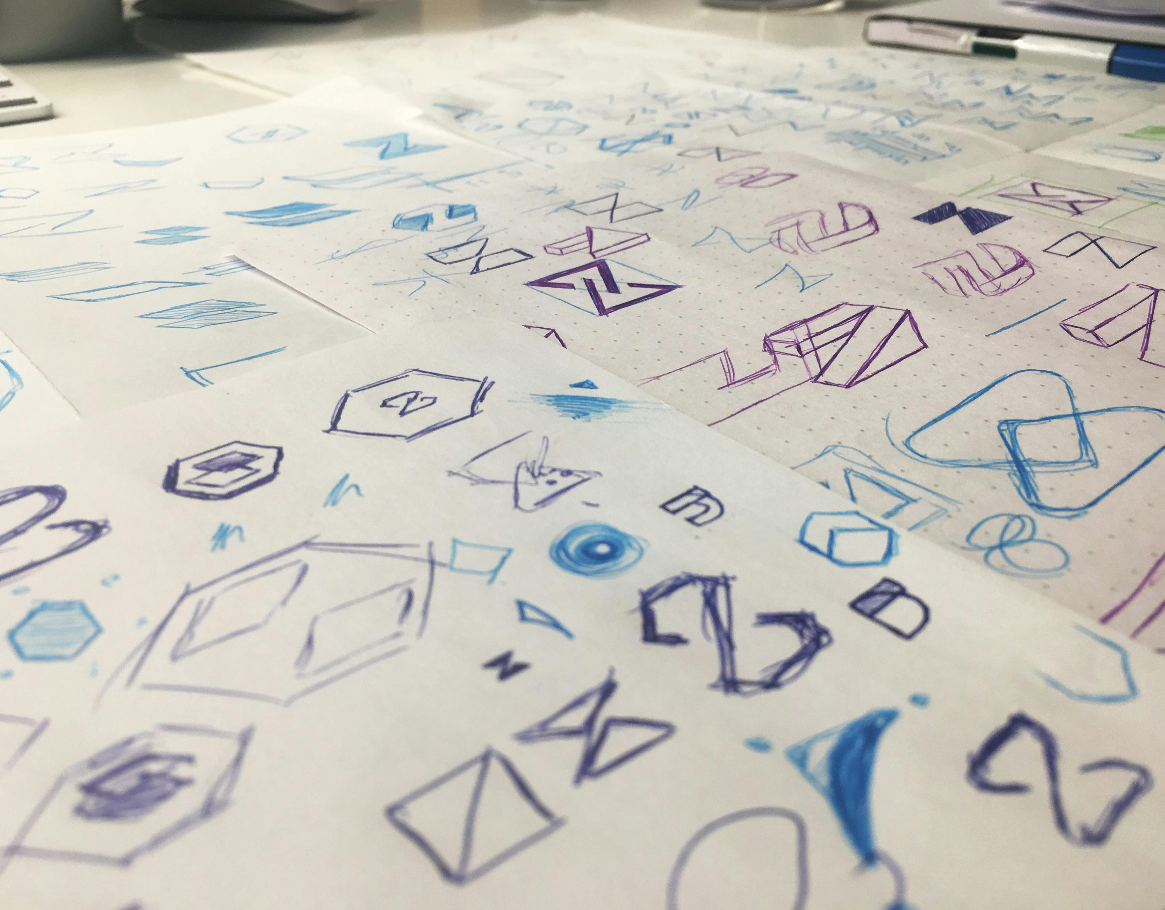
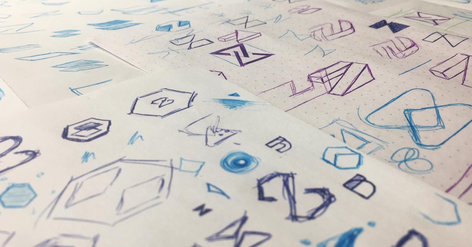
Following those two prerequisites, and with our overall goal of simplicity in mind, we scribbled a lot and tried out a multitude of simple N-shaped logos, narrowed them down, decided on directions, iterated on them over and over again, until we ended up with a handful of logo options. They were all kind of okay and the majority of the team could live with them. The next step would have been to make a decision for one of those.
But the fact that we had to make such a rational decision about something that we will put on everything Nimiq does made us wonder: How can we fascinate the community and everyone else if even we aren’t excited about it? So we took a step back.
A wild idea appears
One reason why none of the logos felt completely right, was that the distinct geometry of the hexagon and the unique form of the N-shaped symbol inside didn’t really match with our aim for simplicity — two shapes, one inside the other, just felt too complex. In fact, each symbol worked a lot better without the hexagon, but leaving the hexagon out wasn’t an option as that would mean losing a big part of Nimiq’s identity.
The other reason was that there already are a lot of hexagonal logos with some kind of letter or symbol out there in the crypto space.
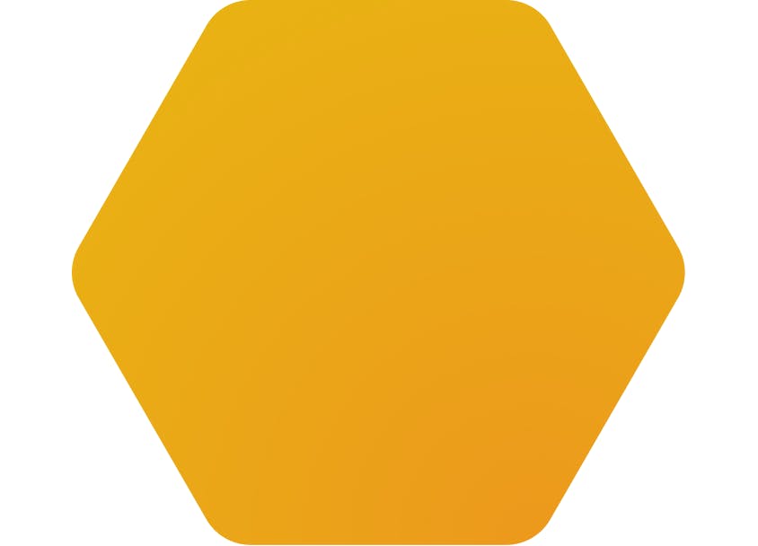
So we thought, why don’t we just follow up on our aspiration for simplicity in the most radical way. Why don’t we just strip away everything besides the hexagon, customize this universal shape just a little bit to make it match with Nimiq’s brand values and go with it? Well, we did just that, and finally got this excitement among the team that had been missing.
A plain hexagon as a logo — is that really all?
One might argue that a hexagon on its own is too generic to be remembered and to stand out. We spent a lot of time thinking and arguing about whether this truly was a feasible option.
In the end, we were convinced: It’s the only true representation of Nimiq and more unique than any other option on the table.
Here’s why:
- The logo fully delivers on being simple.
- It’s an iconic shape that works all around the world in the same way (unlike the Latin “n”).
- The focus on the shape itself enhances the valuable resemblance of a coin, the sun or a piece of gold.
- In contrast to the vast array of clever and overly detailed crypto-logos, Nimiq really stands out — in the context of a logo wall, Coin Market Cap listings etc.
- We have the aspiration for Nimiq to be more than another crypto. Consequently, we need a logo that represents this ambition.
- Last but definitely not least: The plain hexagon is like a clean slate, ready for the community to fill. Anybody can take the logo and add something to it, making it their own while clearly contributing to the Nimiq ecosystem. Here again, the logo mirrors Nimiq’s brand values and a focus on the developer experience in a direct and functional way.
Typography
With the signet settled, we still needed to take care of the typography, for the logo and the overall corporate design. Here, we faced some additional challenges. First, it needed to be very simple and basic, especially after we decided to go for this radical simplicity in the logo, but at the same time we didn’t want to fall back to fonts like Roboto or Open Sans, because we felt we could never make one of those our own, due to the throngs of companies and projects already using them. Still, Nimiq being an Open Source platform, we needed to be sure to use a font that’s accessible for developers — meaning open source and ideally on Google Fonts.
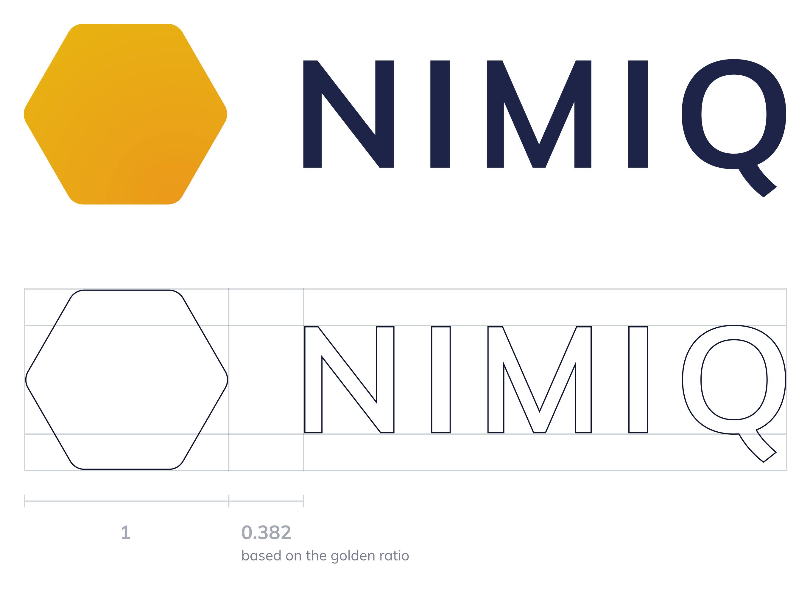
We found a font that ticks all of those boxes: Muli. It’s a very plain and simple sans-serif but has subtle, expressive accents that make it stand out. Furthermore, Muli is on Google Fonts and its source code is publicly accessible on Github.
Wrap up
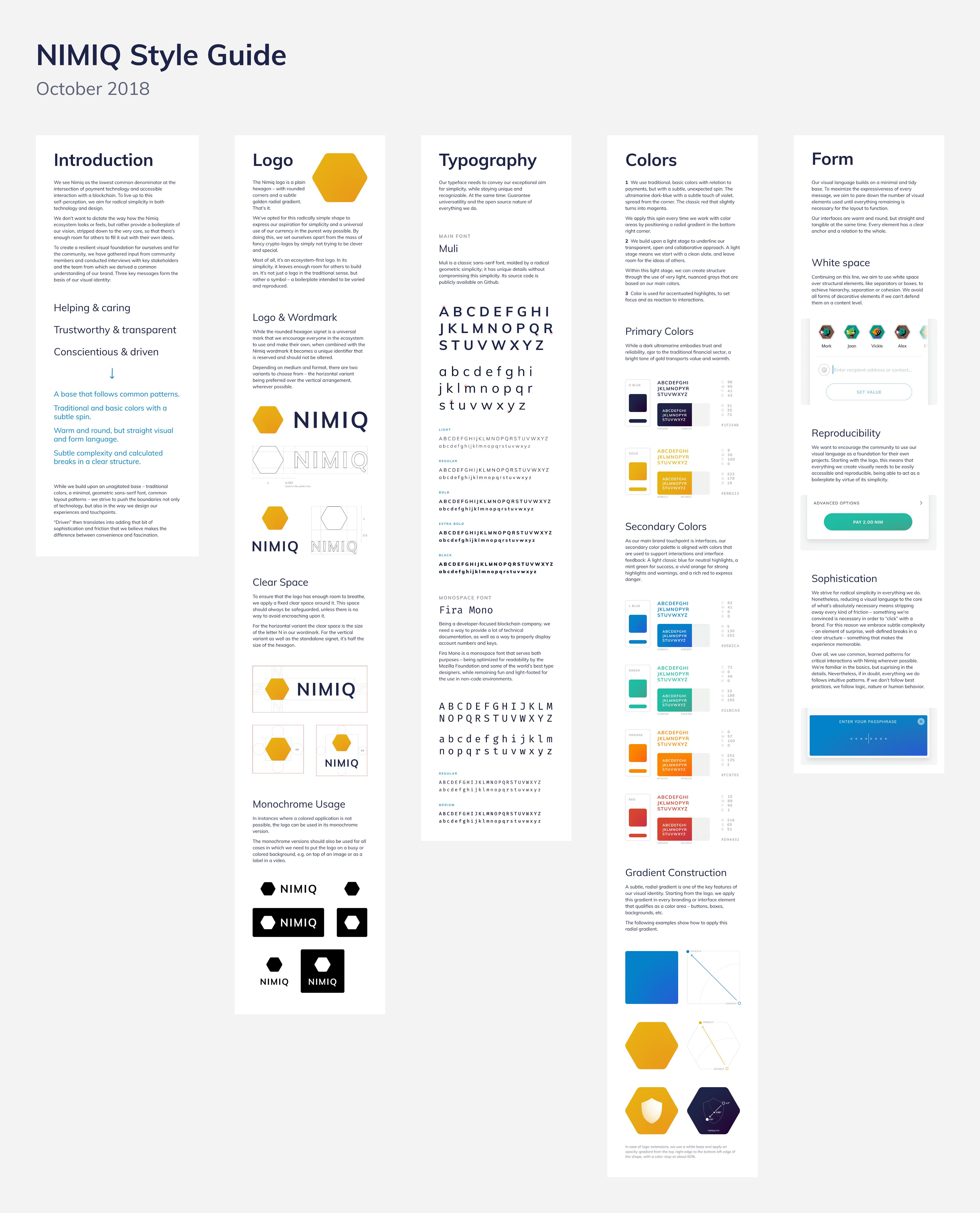
Besides coming up with a new logo, we created a visual language around it, that we want to present in a dedicated style guide. We focus only on the logo in this article because it’s the most tangible representation of it. The new branding will be rolled out in the coming months and we’re very excited to see it in action.
Here’s the link to the style guide: nimiq.com/styleguide (not accessible on most mobile devices for now).
In case you’re on mobile, here’s a PDF fallback: nimiq.com/styleguide/styleguide.pdf